Project Materials
Domo – Smart Home Mobile App
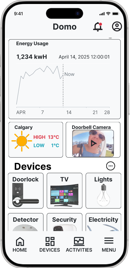
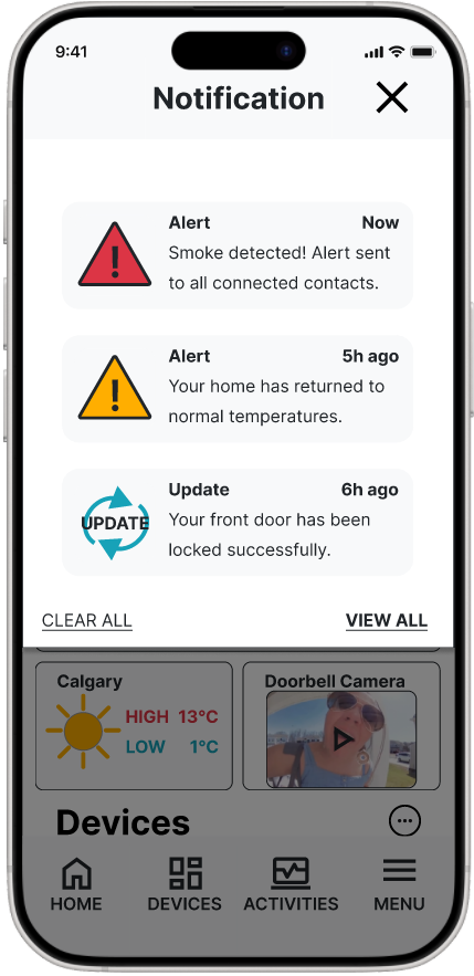
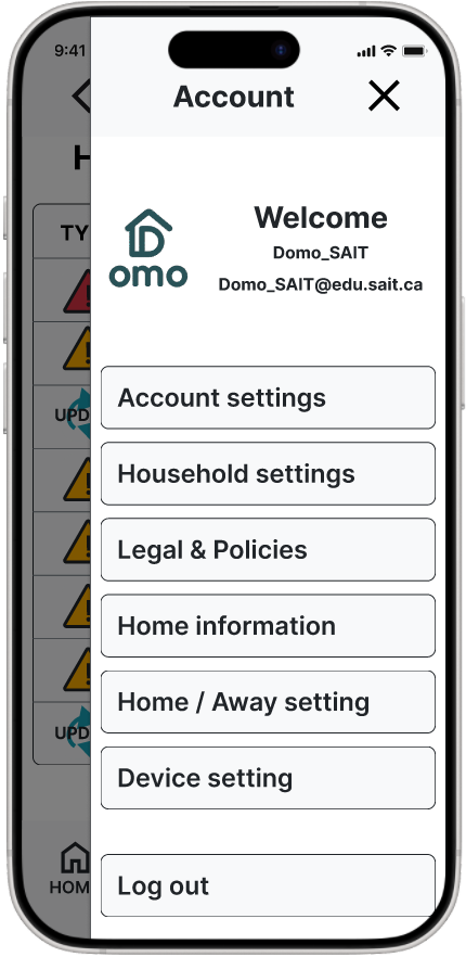
Domo is a smart home app created from February to April 2025. This project took place during the third semester of SAIT's Interactive Design program. I worked with teammates Vernice, Birk, and Angie. Domo allows users to control and monitor devices like security systems, detectors, lighting, TVs, speakers, and appliances. The app focuses on an easy-to-use design and real-time tracking to boost convenience and energy efficiency.
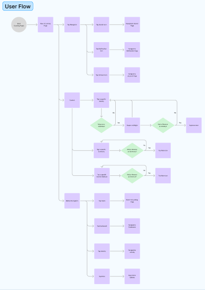
Although fictional, we treated Domo like a real client project. Our team studied competitors such as Google Home, Amazon Alexa, Apple HomeKit, Samsung SmartThings, and Honeywell Resideo. We aimed for usability, expandability, efficiency, quick access, and clear customization options. The project had four main parts: Landing Page, Dashboard, Energy Monitoring, and Security Alerts. I was in charge of designing the Landing Page.
Problem & Design Solution
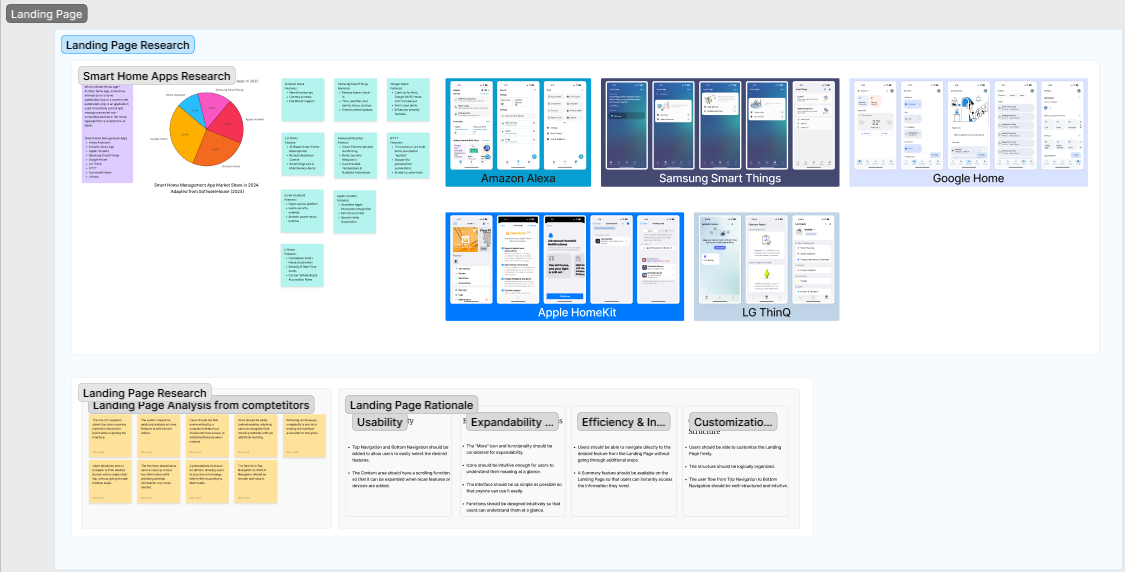
Research into competitor apps on the Apple App Store and Google Play revealed common user frustrations. Many users found too many steps to reach key features and unclear icons. These issues made navigation hard for new users.
To address this, we added clear icons and shortcut functions, which reduced the steps needed to access main tasks. The landing page and dashboard also offer customizable layouts. This helps users personalize their most-used tools and monitor energy use quickly.
Research & Key Insights
We conducted in-depth competitor analysis and team brainstorming sessions, asking "Why," "How," and "What" to define our brand identity, tone of voice, color palette, typography, icon system, and UI components. Insights gathered:
- Users need to reach their desired smart functions with minimal taps.
- Initial onboarding should prioritize clarity through consistent iconography.
- Customization and personalization enhance everyday usefulness.
- Users appreciate energy monitoring features when presented simply and visually.
- My Role & Tools Used
I was responsible for designing the Landing Page. My tasks included:- Competitor analysis & usability benchmarking
- Lo-fi wireframes based on team strategy
- High-fidelity design and prototyping in Figma
- Brand elements and icon systems using Photoshop and Figma
- Design Process
- Discovery & Research
Analyzed major smart home apps and user reviews to uncover pain points. - Brainstorming
Team sessions focused on naming, tone, structure, and brand visuals using the Why–How–What model. - Wireframing
Created low-fidelity layouts and received feedback from instructors. - Visual Design
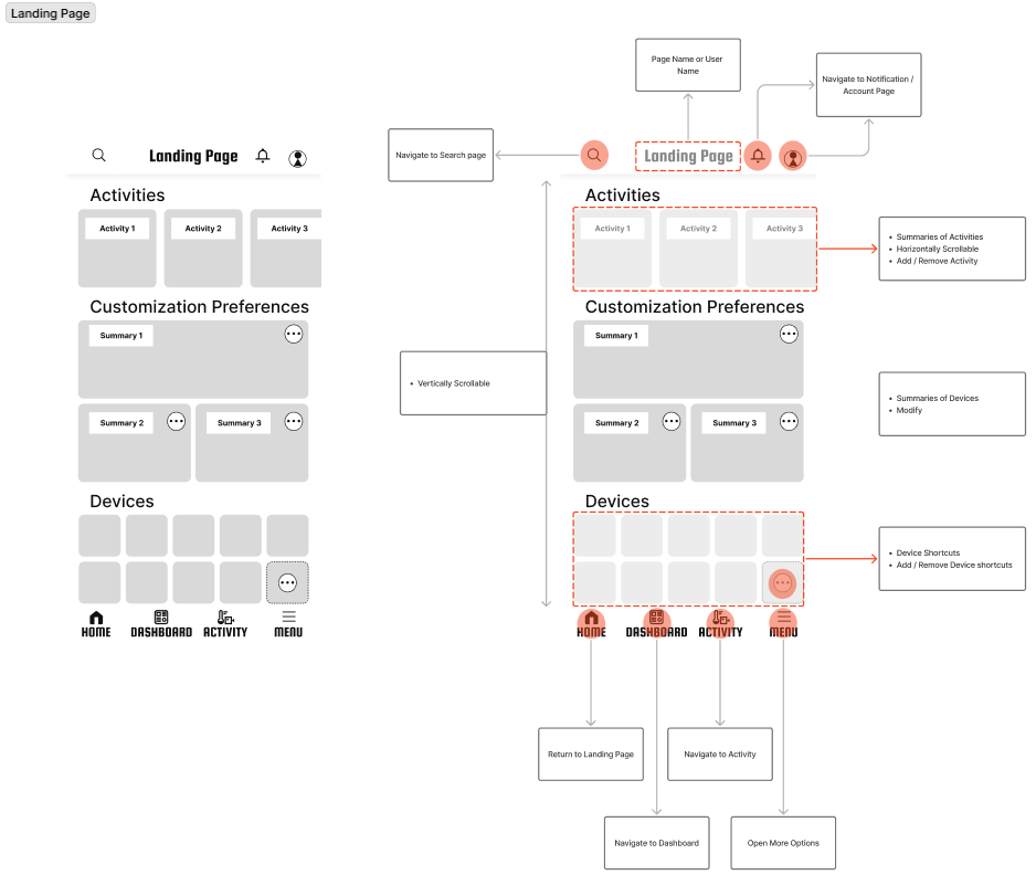
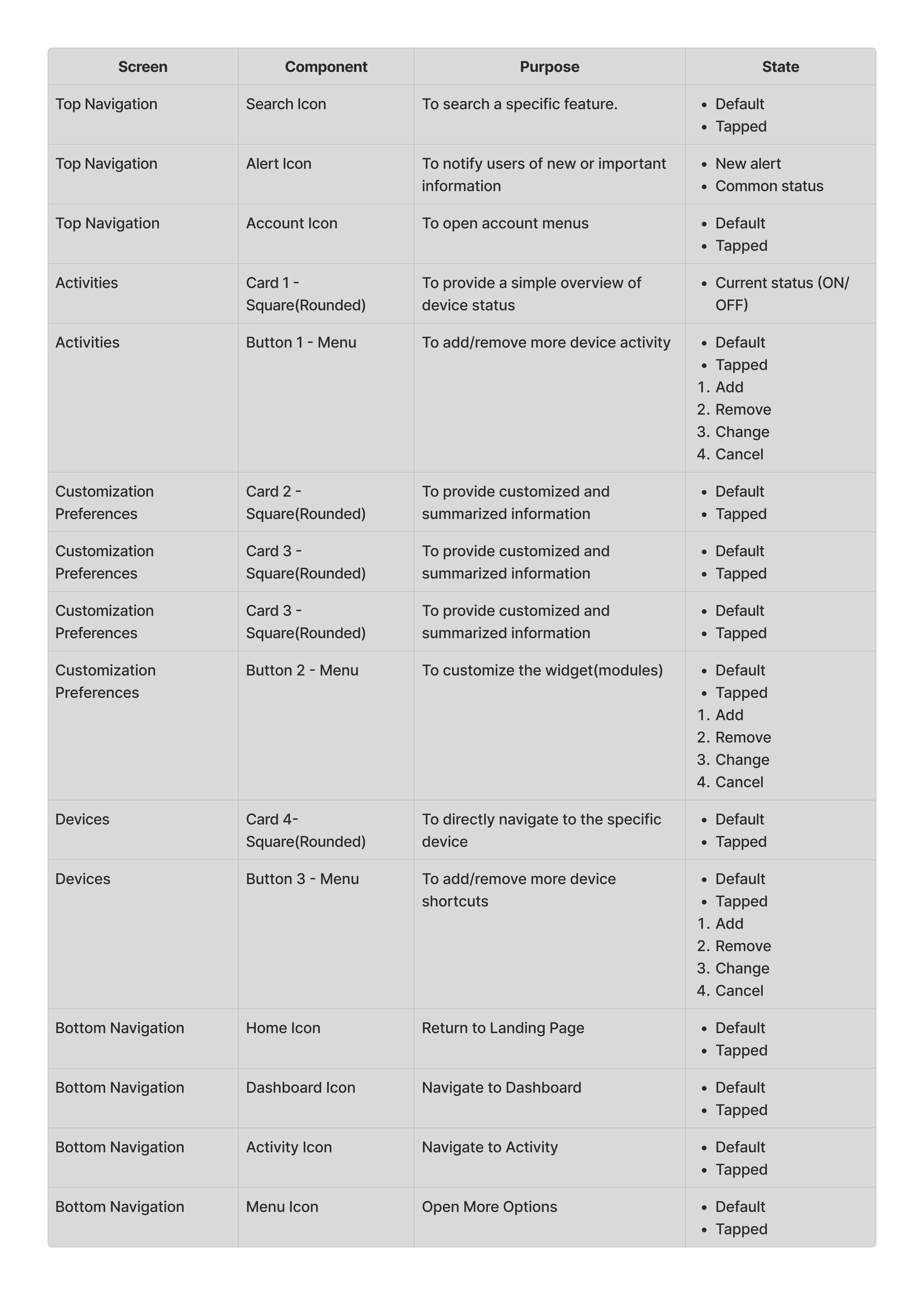
Developed a high-fidelity prototype of the Landing Page in Figma, emphasizing simplicity and customization.
- Discovery & Research
- Final Output in Context
A polished Figma prototype of the Landing Page for Domo
Personalization functions to prioritize user-preferred devices
Integrated visual hierarchy matching dashboard, energy tracking, and alerts
Takeaways
At first, each team member approached their part separately. However, we soon realized the importance of shared flow across the app. Through collaboration and brainstorming, we linked features into a unified structure — gaining insight into real-world teamwork.
I learned how to communicate through Figma and messaging platforms, how to align design systems, and how different members bring unique research styles. This experience gave me confidence in building cohesive products as a team.
Project Team
Attributions and References
- Daniel S. – LinkedIn